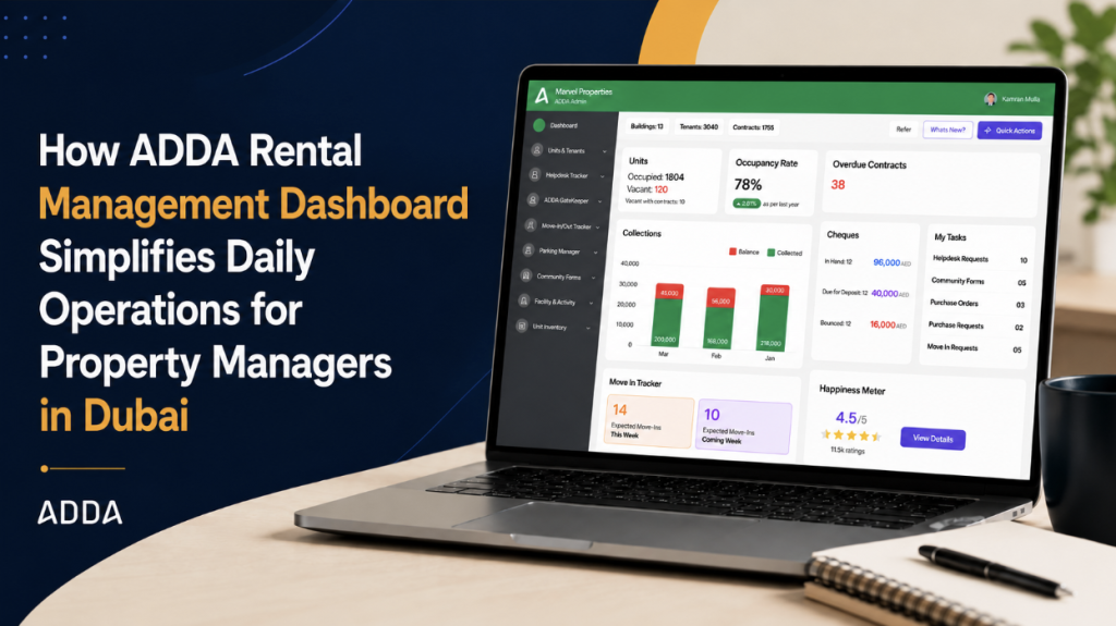
There are roughly three types of property managers in Dubai right now, and none of them are starting their day the way they should.
The first type opens Excel. They have a master sheet, units on one tab, contracts on another, collections on a third, cheques somewhere in the middle. It works, in the same way a bicycle works for a 40-kilometre commute. Technically functional. Not exactly the right tool for the journey though.
The second type uses enterprise software. Something their company bought because it handled everything, ticked every compliance box, and came with a two-day onboarding session and a dedicated account manager. It does handle everything, buried under six menu levels, requiring three report exports to answer one basic question, and costing more per year than a studio apartment in Sharjah. Getting a quick answer from it is like searching for a file in an old email thread: technically possible, but slower than it should be.
The third type uses ADDA ARM. They already have the advantage, the modules work, the data is accurate, and the operational infrastructure is solid. The revamped dashboard now takes that foundation and puts the most critical daily intelligence front and centre, so the property manager who was already ahead of the market moves even further ahead. While everyone else is opening tabs and running reports to piece together their morning picture, the ADDA ARM user already knows what needs action, before the first call comes in.
Why Excel-Based Property Management Systems Fail to Support Daily Operations
Before getting into what the revamped dashboard does, it is worth being honest about why this matters.
The Excel approach has one genuine advantage: the property manager built it, so they understand it. Every formula, every column header, every colour-coded row reflects how their brain organises the work. The problem is that it reflects how their brain organised the work when they set it up, which might have been three years and forty units ago. It does not update itself. It does not tell them what needs attention today. It holds data and waits to be interrogated.
The enterprise software approach has a different problem. These platforms, the ones sold to large property management firms and real estate companies with the promise of end-to-end management, are often genuinely powerful.
They can handle complex multi-building portfolios, produce detailed financial reports, integrate with accounting systems, and generate the kind of regulatory documentation that keeps auditors happy. What they rarely do is make a property manager’s morning easier. The data is all there. But the first screen you see when you log in is not “here is what needs your attention today.” It is a menu. Then a sub-menu. Then a filter. Then a report. By the time you have found out whether your occupancy rate is trending up or down, you have had three interruptions and forgotten what you were looking for.
ADDA Rental Management’s position has always been different from both of these. It is built specifically for the UAE rental market, for the type of portfolio that actually exists here — build-to-rent towers, multi-landlord residential buildings, properties between 50 and 300 units where the management team is small, the landlord expectations are high, and the work moves fast.
The modules work. The question has been whether the entry point, the thing you see when you open the system, reflects the urgency and complexity of what a property manager actually needs to navigate every day.
The revamped dashboard is the answer to that question.
Why Enterprise Property Management Software Makes Daily Tasks More Complex for Property Managers
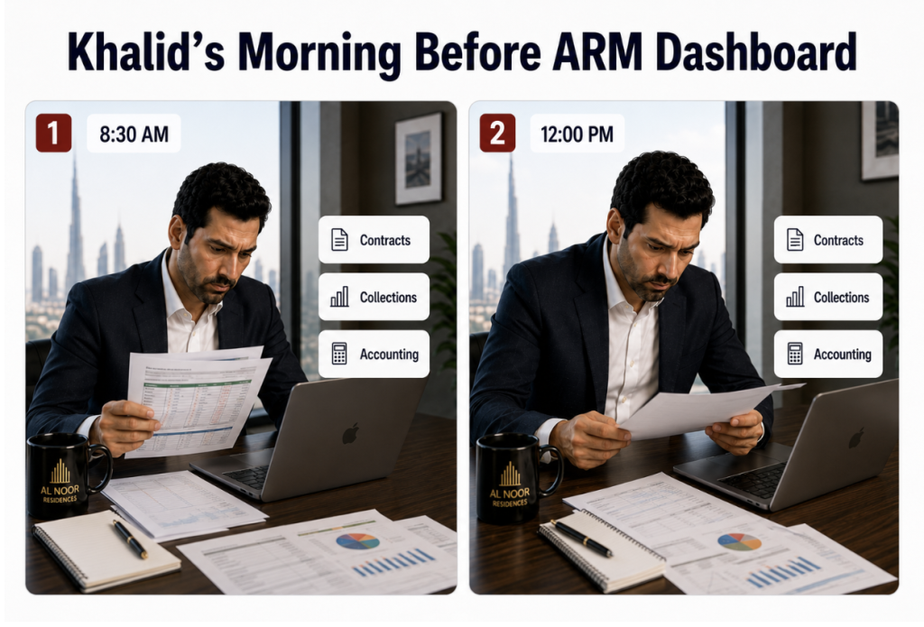
Khalid manages 180 units across two residential buildings in Dubai for a mid-sized property management company. He came from an Excel background, five years of increasingly elaborate spreadsheets before his company moved to an enterprise platform around 2021. That platform did a lot of things. Telling Khalid at 8:30 AM what needed his attention that day was not one of them.
This is not a story about a disorganised property manager. Khalid is thorough. The problem is that his system made thoroughness expensive. Every piece of information he needed to start his day existed in the system. Getting to all of it required a significant amount of navigation that added no operational value.
The Excel managers have an even harder version of this problem. When Khalid’s colleague Fatima Al Hashimi was still running her portfolio on spreadsheets, her morning started with opening the master file, checking the contracts tab for upcoming renewals, cross-referencing the collections tab to see what was outstanding, then opening Tally, which her company used for accounting, to reconcile what had actually cleared against what the spreadsheet said was collected. If there was a discrepancy, which there often was, finding it required going back to source documents. Her morning information-gathering could run to ninety minutes on a complicated day.
The Real Benefits the ADDA ARM Dashboard Brings to a Property Manager’s Day
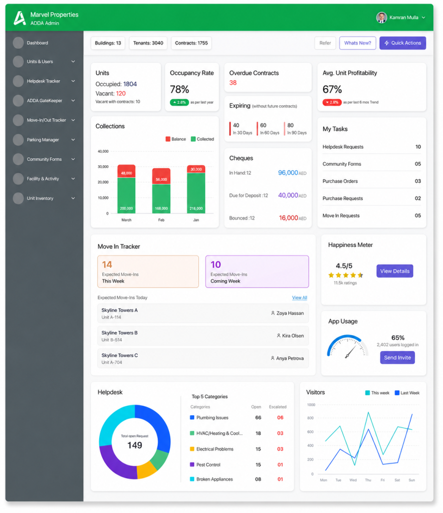
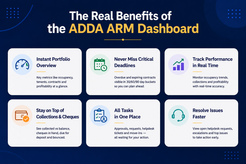
The revamped dashboard is designed around one principle: a property manager should be able to open ADDA ARM in the morning and know, within two minutes, exactly what needs action today. Not after running a report. Not after navigating to four different modules. From the first screen.
Here is what it shows and why it was built that way.
Portfolio overview — buildings, tenants, active contracts
The top of the dashboard shows total buildings under management, total active tenants, and the total value of active and future contracts. These are clickable, each one takes Khalid directly into the relevant module view. This sounds simple, but for a property manager who manages multiple buildings across different landlords, having the portfolio scale visible immediately, and accurate in real time, removes a whole amount of manual work which existed before.
Units and occupancy
Occupied units, vacant units, and vacant units with future contracts are displayed together, with the occupancy rate and a year-on-year trend indicator. Green arrow means occupancy is up versus the same period last year. Red arrow means it is down. The year-on-year comparison is the detail that changes how this number is used. A standalone occupancy rate of 78% tells you a percentage. An occupancy rate of 78% with a green arrow showing it is up 2.8% year-on-year tells you the portfolio is moving in the right direction or, if the arrow is red, that something has changed and it needs attention.
Overdue and expiring contracts
The contracts section shows overdue contracts, those which have already expired, and a tiered view of contracts expiring in 30, 60, and 90 days. This is the view that Fatima used to have to build manually by filtering the contracts report and exporting it to check renewal windows. The reason the 30/60/90-day split matters is that renewal conversations in Dubai take time. A contract expiring in 30 days needs a conversation this week. One expiring in 90 days is still plannable. Also, according to the local laws, tenants should be given advance notice of renewal 90 days before renewal.
Without this view visible every morning, contracts slip — the tenant does not renew, the unit goes vacant, and the revenue gap appears in the landlord report before anyone noticed the window had closed.
Average unit profitability
This is the metric that enterprise software users often have to run a separate report to see and that Excel managers approximate by subtracting their cost columns from their income columns and hoping the formula is still correct. Average unit profitability is calculated as total income minus total expenses divided by total income, averaged across all units. In simple terms: what percentage of the rent collected is actually profit after expenses are accounted for. This number, visible on the dashboard with a trend indicator, changes how a property manager has conversations with landlords about maintenance spend and rent revision.
Collections — balance versus collected, across three months
The collections chart shows rent collected versus outstanding balance for the current month and the two previous months. Green bars are collected. Red bars are outstanding. For Khalid, this replaces the income tracker navigation he was doing every morning. More importantly, it shows trend — if January’s red bar was smaller than February’s, collections are getting worse, not better, and that conversation needs to happen with someone before March closes.
Cheques — in hand, due for deposit, bounced
For property managers still relying on separate cheque management checks, this section surfaces the three numbers that matter most: how many cheques are currently in hand and for what total value, how many are due for deposit today and for what amount, and how many have bounced. The bounced cheques line is the one that previously required Khalid to open cheque management, filter by status, and check whether anything had come back from the bank. If AED 16,000 has bounced, that is on the dashboard the moment he logs in.
My tasks — helpdesk approvals, purchase requests, purchase orders, move-in requests
This is the section that replaces the multi-module navigation entirely for operational approvals. All tasks waiting for Khalid’s action are aggregated in one list: helpdesk tickets where he is set as supervisor, community forms awaiting approval, purchase orders and purchase requests pending sign-off, and move-in requests waiting for verification. Previously, these were spread across four different modules with no single view of the total outstanding workload.
A property manager who does not check one of those modules that morning may not realise they have missed an approval until a vendor follows up or a tenant cannot move in on the agreed date.
Move-in tracker
Expected move-ins this week and next week, with today’s expected arrivals listed by unit and tenant name. Access cards, parking allocations, building orientation, all of the operational preparation that needs to happen before a tenant arrives. Without advance visibility, this preparation happens the morning of, which is not how it should work in a professionally managed building.
Helpdesk — open requests, escalations, top five categories
The helpdesk section shows total open requests, escalated requests, and the top five complaint categories by volume. The category breakdown is the operational intelligence that manually managed portfolios simply do not have. If plumbing issues account for 44% of all open helpdesk tickets, that is not a random pattern, that is a building system that needs assessment. Seeing this on the dashboard rather than in a report that gets generated when someone thinks to run it means the conversation with the facilities team happens before the complaints multiply.
Happiness meter and app usage
Resident satisfaction rating from the helpdesk happiness meter, and the percentage of tenants who are actively using the ADDA app. The app usage figure comes with a Send Invite button directly on the dashboard, if 35% of tenants are not using the app, the property manager can prompt outreach without navigating to a separate module.
Visitor trends
Week-on-week visitor traffic compared to the previous week, visible as a line chart. For buildings where visitor volumes track occupancy patterns and security activity, this provides early visibility into unusual spikes or drops without requiring a separate security report pull.
What Khalid’s Morning Looks Like Now
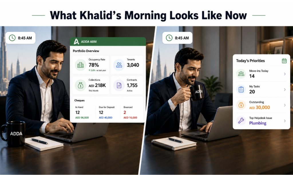
Now Khalid is on top of his day’s plan, within a minute!
He opens ADDA ARM. One screen.
- Occupancy is at 78%, up 2.8% year on year.
- Four contracts expiring in the next 30 days — he clicks through to see which units and books the renewal conversations.
- Collections for the current month show AED 218,000 collected with AED 30,000 outstanding — the previous two months are visible for comparison and the trend is stable.
- Twelve cheques are due for deposit today totalling AED 40,000, two have bounced for AED 16,000 — both need action.
- His tasks list shows ten helpdesk tickets, five community forms, two purchase requests, and five move-in requests waiting.
- Three tenants are arriving today.
- Plumbing issues are the top helpdesk category with six escalations.
He knows all of this before the first phone call of the day. Not because he ran five reports. Because he opened the dashboard.
How Much Time Property Managers Lose Without a Central Dashboard
A property manager handling 150 to 200 units in Dubai typically spends between 45 minutes and 90 minutes each morning navigating across modules or spreadsheets to build a mental picture of the day’s operational state. That is the information-gathering cost before any actual work begins.
At 45 minutes per day, five days a week, across 50 working weeks — that is 187 hours a year spent navigating to information rather than acting on it. At 90 minutes per day, the figure is 375 hours. The equivalent of between seven and fifteen full working weeks, spent every year not managing property, but looking for data.
The dashboard reduces that morning navigation to under five minutes. The information is already assembled. The clickthrough to any section is one tap. The trend indicators remove the need to compare current figures against last month’s report manually. The tasks aggregation means nothing is missed because a module was not opened.
For property management firms considering whether to continue with enterprise platforms that require extensive training, customisation, and licensing fees to produce actionable daily intelligence — the comparison is not just about convenience. It is about what the team is actually doing with their time, and whether the tool they are paying for is reducing their operational workload or adding to it.
Why a Central Dashboard Is Essential for Property Managers in Dubai
Property management in Dubai is not getting simpler. Tenant expectations are higher, landlord scrutiny is tighter, and the pace at which things move inside a 150-unit tower does not pause to let a property manager run a report.
The gap between how most property managers currently start their day — whether through Excel, Tally, an enterprise platform, or a set of individual ADDA ARM modules — and what is now possible with the revamped dashboard is not a marginal improvement in user experience. It is a structural change in how quickly a property manager can move from “logged in” to “know what needs doing.”
Khalid’s five-tab morning routine is now one screen. Fatima’s ninety-minute spreadsheet reconciliation has a cleaner starting point. The property manager who was paying enterprise licensing fees for a system that made them work harder to extract daily intelligence has an alternative that was built for this exact context.
ADDA Rental Management is available to property management companies and operators across the UAE. To see the revamped dashboard or any other ARM feature in action, reach out to the team.
Trusted by property operators across the UAE since 2017. Named clients include Expo Village and Dubai World Trade Centre. Gartner Category Leader 2025. World Realty Congress Gold 2024–25.
Frequently Asked Questions
Does the occupancy rate update in real time, or is it a periodic calculation?
The occupancy rate reflects the current state of units in the system — a unit is counted as occupied when an active tenant is mapped to it. This updates as tenants are added or removed. The year-on-year comparison uses the same calculation applied to the same date range in the previous year.
Can I click through from the dashboard directly to take action, or is it view-only?
Every section on the dashboard is clickable and redirects to the relevant module view. Clicking on bounced cheques takes you directly to Cheque Management filtered to bounced status. Clicking on overdue contracts takes you to the expired contracts view. The dashboard is a command layer, not a read-only display — the intent is to get the property manager to the right place in one tap rather than three navigations.
The enterprise platform we use also has a dashboard. What makes this different?
Tools like Yardi, AppFolio, HappyTenants and similar enterprise platforms are built for large-scale portfolios — think hundreds of properties, multiple geographies, complex ownership structures, and accounting teams that need deep financial configuration.
For that context, the feature depth makes sense. For a 50 to 300-unit residential portfolio in Dubai, it is overkill, and overkill has a cost. Licensing fees for these platforms can run into hundreds to thousands of dollars a month, the onboarding takes weeks, and the day-to-day navigation requires training just to find basic operational information. The dashboards these tools provide are designed for portfolio directors and finance leads reviewing business performance — aggregate revenue, portfolio-wide KPIs, investment returns. They are not designed for the property manager who needs to know, at 8:30 AM, which cheques are due for deposit today and which contracts are expiring next month. ADDA ARM is built specifically for the UAE market and specifically for the 50 to 300-unit range where most of the actual property management work in this country happens. The dashboard reflects that — it shows what a working property manager needs to act on today, not what a fund manager needs to report to a board next quarter.
Does the dashboard cover expense tracking as well?
The average unit profitability metric on the dashboard reflects income minus expenses per unit, pulling from both income and expense trackers. For a detailed breakdown of expenses by category, the Expense Tracker module is still where that drill-down lives. The dashboard gives the summary signal — if profitability has dropped, the Expense Tracker is where you find out why.
We manage properties across multiple buildings for different landlords. Does the dashboard aggregate everything or can we filter by building?
The dashboard aggregates across all buildings the logged-in user has access to. For building-specific views, the clickthrough from each dashboard section takes you into the module with the relevant filter applied. A more granular per-building dashboard view is not part of the current scope but the underlying data is already segmented by building in the modules.
What happens if we have no cheques due for deposit on a given day? Does the cheques section still show?
The cheques section shows the current state regardless. If nothing is due for deposit, the Due for Deposit line shows zero — which is a meaningful data point in itself. A property manager glancing at the dashboard and seeing zero due today has confirmed that no bank run is needed, without having to open Cheque Management to verify.